Principles of Design: Understanding the Basics
Audience and Scope
Are you interested in making ordinary communication materials, such as newsletters, emails, flyers or social media posts, extraordinarily effective? Do you want to create visually compelling designs? Whether you’re creating a presentation, drafting a Facebook post or developing an advertisement, the principles of design can make your work more engaging, effective and pleasing to the eye. This fact sheet introduces the basics of design. By applying these principles, you can improve the visual appeal of your designs and communicate more clearly with your audiences.
Introduction
Have you ever looked at a photo, painting or architecture and not liked it? Have you ever thought that what you were assessing was not appealing? It likely was not using or incorrectly using the principles of design. The principles of design are a set of elements that can be used alone or combined to create objects that are visually pleasing. These principles can apply to photos, drawings, paintings, graphics, videos, architecture and more. Below, you will learn about the eight most common and universally accepted principles of design.
To understand why the principles of design work, it is important to first understand visual weight. This is a measure of how much attention is drawn to specific design elements. Bigger objects, similar shapes, dark colors and high contrast items generally appear visually heavier, whereas smaller objects, light colors and low contrast items generally appear visually lighter. The heavier the visual weight, the more visual attraction it creates. The rest of this document will emphasize the principles of design and the way these principles use visual weight to unify designs (World Leaders in Research-Based User Experience, 2024).
Contrast
Contrast means difference, as denoted by Figure 1. The usage of starkly contrasting colors makes the designs easier to grasp and understand. Contrast is one of the most powerful principles of design because contrast makes things easier to understand and distinguish. Contrast can be created with one or many subjects by using different qualities, such as size, texture, shape, number of objects, color and position. The eye naturally looks for balance or focus, both of which can be achieved using contrast. With a single object or strength in a piece, focus is created. With multiple subjects or objects in a piece, contrast between them creates balance. Creating contrast in a design with words, like a poster or logo, can increase readability. Doing things like varying text size, font or color can also create contrast (Faimon & Weigand, 2004).
| Image | Caption |
|---|---|
 |
Figure 1a. |
 |
Figure 1b. Nike image source: govisually.com/blog/principles-of-de-sign/ |
Hierarchy
Different levels of contrast create hierarchy, which helps unify a design and allows our eyes to move from the most important to least important elements. For example, a movie poster may draw your eye to the photo, then the title, followed by showing dates. This draws your attention to the information the designer believes to be most important, showing its hierarchy(Faimon & Weigand, 2004).
| Image | Caption |
|---|---|
 |
Figure 2a. |
 |
Figure 2b. Movie Poster Hierarchy |
Example of movie poster hierarchy
- Logo/photo/title
- Text below "An Adventure 65 Million Years in the Making."
- The lower text.
Balance
The eye is drawn to balance. Balance is the distribution of visual weight in a design. Balance is created with symmetry and asymmetry. Symmetry often requires the subject of a design to be isolated, so asymmetrical balance is more common with natural world designs (Faimon & Weigand, 2004).
Asymmetrical balance can be created by object placement, orientation, value or color. A smaller element can appear balanced to a larger one just based on where the objects are placed in relation to each other. A smaller object placed higher up in a design balances a larger object lower in the design, for example.
Balance relies on halves. The eye desires equal visual balance from left to right or top to bottom. Due to how our eyes perceive gravity, this can be created by having equal visual weight from left to right or by having a slightly heavier visual weight on the bottom one-half of designs. The images in Figure 3 show balance from the triangles, showing a heavier visual weight on the bottom. The middle image shows equal balance from left and right and from top to bottom with the use of white circles on opposing corners.
| Image | Caption |
|---|---|
 |
Figure 3a. |
 |
Figure 3b. |
 |
Figure 3c. The McDonald’s logo is an example of symmetric balance. McDonald‘s image source: govisually.com/blog/principles-of-design/. |
Proportion
Proportion is the relation of one part of a design to another or the whole design based on size, length, width, color or other design elements. It is based on the golden section, a relationship seen in nature and mathematics. The golden section is where the smaller elements or sections of a design are the same ratio as the larger elements and sections.
| Image | Caption |
|---|---|
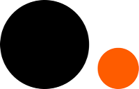 |
Figure 4a. |
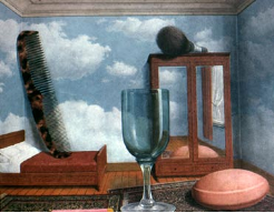 |
Figure 4b. Image source: Principles of Design (augustana.net) |
Rhythm
Rhythm is the movement or fluctuation of related elements. It can be created with regular or irregular spacing and often conveys feelings of calmness or excitement, depending on the nature of the rhythm (Chapman, 2019). When using rhythm, it is important to be consistent or create differences with intent to prevent throwing the entire design off balance (Faimon & Weigand, 2004). The images in Figure 5 show rhythm by using the same shapes in repetition (left image) or by using similar colors and shapes to draw a viewer’s eye across the image.
| Image | Caption |
|---|---|
 |
Figure 5a. |
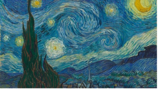 |
Figure 5b. Image: The Starry Night – Vincent Van Gogh |
Pattern
Pattern repeats elements that are evenly spaced and similar. Pattern is like rhythm, but rather than focusing on the frequency of reoccurring elements, pattern focuses on similarities in spacing or the elements themselves. Things like textures, tiles, quilts, (like the one in Figure 6) and housing structures create patterns (Faimon & Weigand, 2004). Patterns and rhythms help the viewer’s eye move through the design without getting lost or focusing on one element for too long.
| Image | Caption |
|---|---|
 |
Figure 6a. |
 |
Figure 6b. Image source: Quilting board Forums |
Unity
Unity is the amount of sameness between elements of a design. It is important to have some unity in a design, but too much can be boring or repetitive. Because design is intentional,too little unity can make a design seem poorly planned or hard to follow. Unity can be portrayed with similar sizes, colors, fonts or elements (Faimon & Weigand, 2004). In Figure 7, unity is portrayed in the left image by using squares of the same size and color, where the image on the right displays unity with vintage soda bottles repeating.
| Image | Caption |
|---|---|
 |
Figure 7a. |
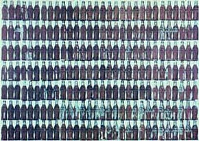 |
Figure 7b. Right image source: Principles of Design (augustana.net) |
Variety
Much like unity, variety is important, but too much can be negative. Variety adds differences to a design and prevents it from looking too boring and bland. With variety, there must be similarity and unity to tie the differences together, as shown in the images in Figure 8. Notice the two images provide difference in color and movement, yet have similarities in shape and element, which creates an appealing design. Unity and variety balance each other. Too much or too little of each, and the design loses visual weight and is less appealing to the viewer (Faimon & Weigand, 2004).
| Image | Caption |
|---|---|
 |
Figure 8a. |
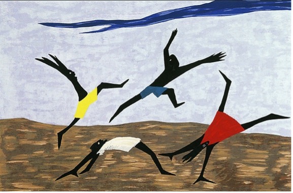 |
Figure 8b. Right image: Harriet Tubman Series (Panel 4) - Jacob Lawrence |
Conclusion
Some designers naturally adhere to these principles without being aware of it. At other times, a designer might struggle to identify why a design is not effective, but by referencing these principles, they can often pinpoint the issue. It is crucial for both novice and experienced designers to grasp the elements and principles of design and how they interact. Purposefully and intentionally applying these principles in design projects is essential for producing visually attractive and functional designs (Chapman, 2024).
References
Chapman, C. (2019, September 24). Breaking down the principles of design (with infographic): Toptal®. Toptal Design Blog. https://www.toptal.com/designers/gui/principles-of-design-infographic#:~:text=There%20are%20twelve%2 basic%20principles,that%20make%20sense%20to%20users
Faimon, P. & Weigand, J. (2004). The nature of Design. How Design.
World Leaders in Research-Based User Experience. (n.d.). What is visual weight? (video). Nielsen Norman Group.
